
- App Name : Glean | Grocery Shopping App React Native Expo UI Kit
- Created : 04 Oct 2026
- Last Updated : 10 Oct 2026
- Version : 1.0.0
- Platforms : Android, iOS, Web
- Framework : React Native (Expo SDK 55, RN 0.83, React 19)
- Author : MKTemplateWizard
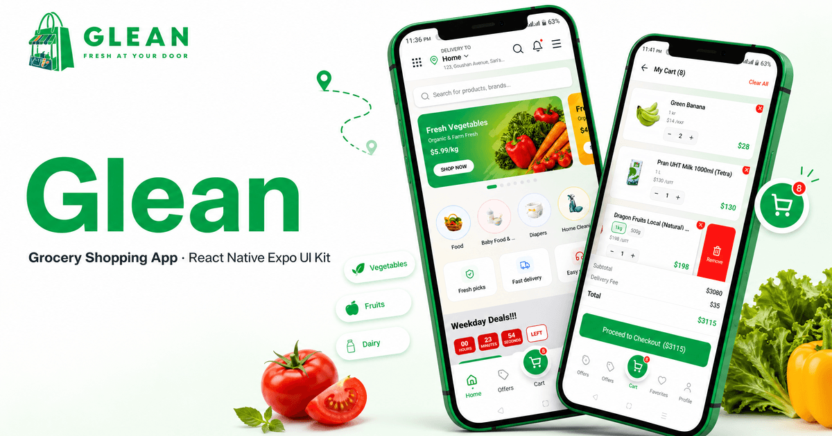
Introduction
Glean - Cross-Platform Grocery Shopping Mobile Application
Glean is a complete, production-quality grocery delivery marketplace UI kit built with React Native and Expo. It ships with 61 routes, a full mock API layer, an offline AI demo, 10 languages and 20 currencies - no backend or API keys required to run.
The kit covers the entire shopping journey: onboarding, authentication, a rich home page, product browsing with filters, cart, a full checkout (address + map, delivery options, time slots, tips, voice-note instructions, payments), orders, invoices, two-way order tracking, returns & refunds, product requests, shopping lists, favorites, referrals, outlets, and an AI suite (assistant, guided find/gift flow, comparison, visual search).
Everything runs on bundled demo data. A typed API layer mirrors REST contracts for the flows that already use it; the rest of the app reads bundled data or Zustand stores directly, so connecting a real backend means implementing the endpoints and migrating the remaining screens (Backend Integration lists them).
- 61 routes across tabs, auth, checkout, orders, AI, maps and settings
- 272 products, 39 categories, 43 brands of fictional demo catalog data
- 18 Zustand stores with AsyncStorage persistence
- 10 languages (including RTL Arabic) and 20 currencies, switchable live
- No-backend demo - every screen is served by a bundled mock database (relational lookups between products, variants, orders and coupons) with simulated latency; no server or API keys are needed. Browsing still requires a connection (map tiles stream online), and the kit includes a designed no-internet screen for when connectivity drops.
- AI demo - assistant, find/gift flows, comparison, visual search (camera/gallery)
- Leaflet + OSM maps in a WebView - no API key, works in Expo Go
Requirements
Before setting up the project, ensure your development environment meets these requirements:
Node.js
Node.js 20.19.4+ and npm 22.6+.
Node.js Download
Git
Required for version control and package management.
Expo Go / Emulator
For the fastest start, install the Expo Go app on your phone and scan the QR code. Alternatively use an Android emulator (Android Studio) or the iOS simulator (Xcode, macOS only). Official docs: docs.expo.dev.
Tech Stack At A Glance
- Expo SDK 55 (~55.0.31) with React Native 0.83 and React 19
- Expo Router - file-based routing with typed routes
- NativeWind v5 preview - Tailwind CSS for React Native
- Zustand v5 - 18 stores with a shared AsyncStorage adapter
- TanStack React Query v5 + Axios - server state and API layer
- i18next / react-i18next - 10 languages, live switching, RTL support
- react-hook-form + Zod - form state and validation
- react-native-reanimated - gestures and animations
- react-native-webview - Leaflet + OSM maps with OSRM routing
- expo-image-picker - camera/gallery for visual search and profile photos
- expo-audio - voice-note delivery instructions
- expo-print / expo-sharing / expo-file-system - invoice export
Project Folder Structure
glean/
├── app.json                  # Expo config: name, icons, splash, plugins
├── eas.json                  # EAS build profiles (development / preview APK / production AAB)
├── metro.config.js           # Metro + NativeWind
├── scripts/
│   ├── verify-integrity.js   # routes + asset reference checks (npm run verify)
│   └── smoke-tests.ts        # dependency-free unit tests (npm test)
└── src/
    ├── app/                  # Expo Router routes (61 screens)
    │   ├── _layout.tsx       # Root layout: providers, offline handling, overlays
    │   ├── (auth)/           # login, signup, OTP, password reset, legal
    │   ├── (main)/           # orders, addresses, profile settings, returns, referrals...
    │   ├── (tabs)/           # home, categories, cart, offers, favorites, profile
    │   ├── ai-*.tsx          # assistant, comparison, shopping flow, visual search
    │   ├── product/[slug].tsx
    │   ├── search.tsx / search-results.tsx
    │   └── checkout.tsx / online-payment.tsx / order-success.tsx
    ├── screens/              # screen implementations used by the routes
    ├── components/           # ai, cards, modals, navigation, products, ui
    ├── store/                # 18 Zustand stores + storage adapter
    ├── services/
    │   ├── api/              # typed REST endpoint functions
    │   ├── mock/             # in-memory relational demo database + handlers
    │   ├── queries/          # TanStack Query hooks
    │   └── ai/               # AI provider boundary + mock provider
    ├── hooks/                # pagination, currency, network, debounce, refresh
    ├── lib/                  # types, i18n, data, validation, map config
    ├── providers/            # React Query provider
    ├── config/               # environment + home section mapping
    └── assets/
        ├── images/           # placeholder images (products, categories, brands, banners, backgrounds, offers, onboarding)
        └── icons/            # flags, payment methods, social icons
Images & icons: all bundled art lives under src/assets/images/ (products, categories, brands, banners, backgrounds, offers, onboarding, logos) and src/assets/icons/ (flags, payment methods, social icons). Each feature section below lists the exact files it uses.
Installation & Setup
- Install dependencies
npm install - Start the dev server
npx expo start - Open the app - scan the QR code with Expo Go, or press
afor an Android emulator,ifor the iOS simulator,wfor web.
No environment file is required to run: the app defaults to the bundled mock API, mock AI and OpenStreetMap tiles.
Demo Credentials
The login screen has a Demo Login button that signs you in instantly. If you prefer typing:
- Email: demo@glean.com
- Password: Demo@123
Guest and social logins work too - they start with an empty phone number, which demonstrates the "Complete profile" gate in checkout.
Running & Building
Development
npx expo start          # dev server (Expo Go)
npx expo start -c       # dev server with a cleared Metro cache
Clear the cache (-c) whenever you add/remove/rename assets or change global CSS.
Local release APK
npx expo prebuild --clean
cd android
.\gradlew assembleRelease
The APK is written to android/app/build/outputs/apk/release/app-release.apk. The generated Gradle project signs release builds with the debug keystore by default - use your own keystore for store releases.
Cloud builds (EAS)
npm install -g eas-cli                              # or use: npx eas-cli
eas login                                          # sign in - https://expo.dev/login
eas init                                           # create your own EAS project
eas build --platform android --profile preview      # installable APK (internal)
eas build --platform android --profile production   # AAB for the Play Store
eas build --platform ios --profile production       # iOS archive
EAS builds run prebuild in the cloud, so you never need a local android/ or ios/ folder. Before the first build: update the app identity in app.json, install the CLI (npm install -g eas-cli) and sign in with eas login - create a free Expo account at expo.dev/login. Full reference: docs.expo.dev.
App identity (do this first)
expo.name- display nameexpo.slug- Expo project slugexpo.scheme- deep-link schemeexpo.ios.bundleIdentifier- unique iOS application IDexpo.android.package- unique Android application ID- App icon, adaptive icon and splash assets under
src/assets/images/
App Configuration
Everything that shapes the shipped app: environment variables, the Expo manifest, and the theme tokens.
Environment Configuration
Copy .env.example to .env (or .env.local) when you want to override the defaults. Everything is optional - the demo runs offline out of the box.
EXPO_PUBLIC_API_BASE_URL=http://localhost:3000/api/v1
EXPO_PUBLIC_USE_MOCK_AI=true
EXPO_PUBLIC_MAP_PROVIDER=osm
EXPO_PUBLIC_MAPTILER_KEY=
| Variable | Purpose |
|---|---|
EXPO_PUBLIC_API_BASE_URL | Base URL of your real backend (used once mock mode is disabled). Defaults to localhost in dev. |
EXPO_PUBLIC_USE_MOCK_AI | true (default) serves AI replies from the bundled provider. Set to false after implementing the provider boundary (see AI Layer) - screens that import the bundled mock service must be migrated first. |
EXPO_PUBLIC_MAP_PROVIDER | osm (default, keyless) or maptiler (needs a key, falls back to OSM without one). |
EXPO_PUBLIC_MAPTILER_KEY | MapTiler API key, only used with maptiler. |
The mock API is on by default (USE_MOCK_API = true in src/config/env.ts), so every service-layer call is served by the bundled mock handlers and the demo runs fully offline. The browse-first screens additionally read the demo catalog in src/lib/data/* directly for instant, offline browsing. See Backend Integration for the exact switch procedure.
App JSON Configuration
app.json holds the Expo configuration. Key fields:
| Field | Notes |
|---|---|
name, slug, scheme | App name, project slug and deep-link scheme. |
version | 1.0.0 - bump for each release. |
userInterfaceStyle | light - the kit is designed light-only. |
icon, ios.icon, android.adaptiveIcon, web.favicon | App icons (green adaptive background #4CAF50). |
ios.bundleIdentifier, android.package | Unique application IDs - change before publishing. |
plugins | expo-router, expo-splash-screen (brand-green background; the animated logo + tagline loading screen is JS at src/app/splash.tsx), expo-sharing, expo-asset, expo-image-picker (permission texts), expo-audio. |
experiments | typedRoutes and reactCompiler enabled. |
The template intentionally ships without a seller-owned owner or EAS projectId - run eas init after signing in to create your own project.
Theme & Styling
Styling is NativeWind v5 (Tailwind for React Native) with design tokens defined once in src/global.css:
--color-primary- brand green#00B64B(buttons, active states, links)--color-background/--color-foreground- app surface and text--color-card,--color-muted,--color-border- surfaces and separators- Gradient helpers:
bg-gradient-green-top,bg-gradient-warm-bottom,bg-gradient-brand-deep(profile header)
Components use token classes (bg-background, text-foreground, bg-primary) so changing the tokens in src/global.css re-themes the whole app. The kit renders light-only by design (userInterfaceStyle: "light").
Tap feedback is centralized in src/components/ui/RipplePressable.tsx: it picks a circular ripple for square/round buttons and a masked ripple for wide items, plus a subtle pressed dim on every platform.
Architecture Overview
Navigation & Routing
Routing is Expo Router (file-based). Groups keep the URL structure clean:
src/app/
├── (auth)/      → /login /signup /verify-email /forgot-password /otp-verification
│                  /reset-password /reset-success /registration-success /terms /privacy
├── (tabs)/      → / (home) /categories /cart /offers /favorites /profile
├── (main)/      → /orders /orders/[id] /orders/invoice/[id] /addresses /add-address
│                  /edit-profile /change-password /referrals /returns /returns/new
│                  /track-order /track-order/[id] /income /faq /help-support
│                  /language /currency /offer-details /product-requests
├── ai-*.tsx     → /ai-assistant /ai-shopping-flow /ai-comparison /ai-visual-search
├── product/     → /product/[slug]
├── brands/      → /brands /brands/[id]
├── shopping-list/ → /shopping-list /shopping-list/[id]
├── categories/  → /categories/[slug]
└── root screens → /splash /onboarding /language-select /currency-select
                   /search /search-results /checkout /online-payment /order-success
                   /outlets /contact /refund-policy /no-internet /not-found
Typed routes are enabled (experiments.typedRoutes), so route names are checked at compile time. The tab bar is a custom component (src/components/navigation/TabBar.tsx) with a wave-shaped center cart button and a live cart badge.
State Management
18 Zustand stores handle all client state. Persisted stores use a shared AsyncStorage adapter (src/store/storage.ts), so state survives restarts:
| Store | Responsibility |
|---|---|
authStore | Session, demo/social login, profile data |
cartStore | Cart items, variants, quantities, totals |
favoriteStore | Favorites / wishlist |
addressStore | Saved addresses + selected delivery address |
paymentStore | Selected payment method |
orderStore | Placed orders, delivery zone/option/window, contact info |
shoppingListStore | Shopping lists and their items |
couponStore | Applied coupon |
currencyStore | Selected currency + formatting defaults |
outletStore | Outlet filters (district / thana) |
notificationStore | Notification preferences |
onboardingStore | Onboarding completion + first-run flow |
offerPopupStore | Home offer popup dismissal (once per install) |
productRequestStore | Product sourcing requests |
returnRequestStore | Return/refund requests |
backToTopStore | Floating "back to top" visibility per screen |
uiStore | Drawers and modal visibility (category, side, address, notifications) |
Data Layer & Mock API
The demo needs no backend, and two data paths work together:
- Typed service layer -
src/services/api/*documents the REST contracts (endpoints, params, response envelopes) andsrc/services/queries/*wraps them in TanStack Query hooks. WithUSE_MOCK_API = true(default) every call is answered by the bundled handlers insrc/services/mock/*(relational demo database indb.ts, simulated 150ms latency) - no server required. - Bundled catalog data - browse-first screens (home rails, categories, search results/product details, brands, offers, stories, outlets) read the typed demo modules in
src/lib/data/*directly. This is what keeps browsing instant and fully offline. - Client state - cart, coupon, payment selection, addresses, orders and UI state live in persisted Zustand stores (
src/store/*).
Flows that already run through the service layer: login and sign-up (authApi), product queries, category queries, delivery quotes and order-history reads. Everything else is local until you migrate it: cart and checkout/order placement (orderStore.createOrder), addresses, coupons and payment methods (Zustand stores), reviews (a local hook with hard-coded demo reviews), related products (bundled catalogue), password reset / OTP / email verification / change-password (setTimeout simulations), and offers, stories, outlets, wishlist, returns, shopping lists, notifications and referrals (no API module exists yet). Backend Integration lists exactly what to implement and which files to migrate.
Note: the demo still checks real connectivity (the no-internet screen appears when the device is offline) and map tiles stream from the provider.
Localization & Currency
- 10 languages: English, Bengali, Arabic (RTL), Spanish, Japanese, Hindi, French, German, Russian, Portuguese - switchable live from Settings and persisted.
- RTL support: Arabic flips the layout direction and status-bar handling.
- 20 currencies: USD, EUR, GBP, AED, SAR, INR, PKR, BDT, EGP, TRY, JPY, CNY, KRW, CAD, AUD, CHF, MYR, PHP, IDR, THB - with per-locale defaults and a shared formatter (
useFormatCurrency). - Flags: bundled as WebP icons in
src/assets/icons/flags.
Translation files live in src/lib/locales/*.ts. AI response copy is English-only in the demo; all other UI text is fully localized.
AI Layer
The AI features run through a provider boundary in src/services/ai/index.ts. The bundled mock provider simulates thinking latency (650ms) and answers from the demo catalog: it can search products, add to cart, compare items, and answer delivery/policy questions. Everything AI in the kit is an offline demo - no hosted AI service is called.
Visual search is demo mode: it uses the real camera/gallery picker but the matching is simulated against the bundled catalog (the screen shows a "Demo" badge and a note explaining this). Replace the provider to run real image recognition.
To run your own model, implement the provider in src/services/ai/index.ts and set EXPO_PUBLIC_USE_MOCK_AI=false. Note: the screens currently import the bundled mockAIService directly (guided flow, comparison, visual search, search interpretation, home recommendations, favorites insight and the product review/Q&A panels), while the assistant chat uses the provider boundary. Migrating those imports to the provider interface is part of the work. No API keys ship in the app.
Features & Screens
Every screen below runs on the bundled demo data and is fully interactive - including payments, orders, returns and the AI flows.
Authentication
All authentication is simulated against the mock API and persisted in authStore.
- Login - email + password, show/hide password, "remember me", inline validation, social buttons (Google / Facebook, simulated), and a one-tap Demo Login.
- Sign up - full form with validation, terms checkbox, social sign-up buttons.
- Email verification + Registration success screens.
- OTP verification - 6-digit input with resend timer (
useResendTimer). - Forgot / reset password with a reset-success confirmation.
- Guest & social logins start with an empty phone number - checkout then shows a Complete profile gate that routes to Edit Profile before ordering.
- Legal screens - Terms and Privacy (also reachable from Settings).
Resources: social button icons in src/assets/icons/social-icons/; brand logo on auth screens in src/assets/images/logo.png.
Home Screen
Top Bar
Delivery address (opens the address modal), search entry, notification bell with unread dot, and a menu button that opens the side drawer. The category drawer opens from the grid icon.
Hero Slider (Stories)
A looping, center-snapping banner slider with auto-play:
- Infinite loop - first/last slides are cloned so scrolling never hits a wall; reaching a clone rewinds silently.
- Center snapping with pagination dots.
- Two content modes: slides with title/subtitle/price/CTA render a text overlay; slides with only an image (full-design art) render the artwork alone - both work out of the box.
Banners live in src/lib/data/stories.ts (images in src/assets/images/banners, 700x300).
Resources: section backgrounds and promo art in src/assets/images/backgrounds/ (promo-1/2, background-1..7); offer popup poster in src/assets/images/offers/popup-offer.webp.
Home Sections
- Category grid - quick navigation with icons.
- Weekday deals - live countdown to midnight, category tabs (milk, spices, chips & nuts...), deal rail.
- Promo product rows - a promo card on the left (image with badge/headline/CTA, or full-design
imageOnlyart) next to a product rail. The card sizes itself from the artwork so nothing is cropped. - Featured finds - themed band with a product rail.
- Offers collections - hero banner + two overlay cards, each sized to its artwork.
- Product rails - premium meat, cooking essentials and more (config in
src/config/homeSections.ts). - Brand slider, outlets section, AI recommendations.
Offer Popup
A promo poster modal appears once after the home loads (2s delay). Dismissal is persisted - it does not show again on the next launch. The poster ratio is derived from the asset, so any export size works.
Floating Controls
- AI assistant button - floating green FAB, hidden on splash/onboarding, auth flow, cart, checkout, the AI chat itself and the offline screen; visible everywhere else (including home).
- Back to top - appears after scrolling with per-screen clearance so it never covers bottom bars.
Product Browsing
Categories
The categories tab shows a two-column grid with inline drill-down (root → sub → child) and a full category listing screen (/categories/[slug]) with a sidebar, sorting and pagination.
Search
- Live suggestions as you type (debounced).
- AI interpretation of natural-language queries ("something for breakfast").
- Recent & trending searches (persisted).
- Entry point to visual search (camera/gallery).
Search Results & Filters
- Filters: category tree, brand, price range, rating, shipping options - each with its own bottom sheet.
- Sorting: relevance, price (low/high), rating, newest, discount.
- Paginated grid with skeleton loaders and pull-to-refresh.
Product Detail
- Image gallery, discount badges, stock states (out-of-stock disables add-to-cart with a notify option).
- Variant picker (size/weight) with live price and stock per variant.
- AI review summary and an AI Q&A panel.
- Customer reviews, rating breakdown, related products.
- Sticky bottom bar: price, quantity, add to cart, buy now.
Favorites
Grid and list views (ProductListRow), a "You may also like" rail, and an AI wishlist insight card.
Brands & Outlets
- Brand directory (
/brands) with a featured slider and full brand pages. - Outlets - list + map view, district/thana filtering, outlet detail modal, and directions via OSRM routing in the WebView map.
Resources: product photos in src/assets/images/products/ (referenced from src/lib/data/products/*); category tiles in src/assets/images/categories/ (from src/lib/data/categories.ts); brand logos in src/assets/images/brands/ - 43 neutral placeholders, one per entry in src/lib/data/brands.ts (all logos ship local, no remote URLs).
Cart & Checkout
Cart
- Quantity steppers with live totals, variant labels and per-line pricing.
- Coupon entry with validation (percentage, fixed, caps, minimum purchase).
- Persisted across restarts (
cartStore). - The tab bar and floating controls hide on the cart so the sticky summary and checkout CTA own the screen.
Checkout
A single scrolling checkout with three tabs: Delivery Options, Tip and Instructions.
- Address selection - a bottom-sheet address drawer with saved addresses, "Save & use", and a full add-address flow including a Leaflet map picker (drag the pin or search; reverse geocoding via Photon with a BigDataCloud fallback).
- Delivery options - Standard, Express and Schedule for Tomorrow, priced by delivery zone (Central / North / South / Outside Dhaka). Free-delivery thresholds show as "Free"; a failed quote shows an "Unavailable - pull to retry" state with a retry button.
- Time slots - windows from 8-10 to 20-22 with a 1-hour lead time; passed windows are disabled today, and every window is open for tomorrow. Choosing "Schedule for Tomorrow" opens the window picker automatically.
- Tip - presets (0 / 10 / 20 / 50) and a custom amount. Choosing Cash on Delivery with a tip shows a warning that the rider cannot carry change.
- Instructions - a voice-note drawer (record/play via
expo-audio) plus quick options: hand it to me, knock the door (prepaid only), no bell, leave at door, no calls. - Payment - brand-icon method list: Cash on Delivery, bKash, Nagad, Visa, Mastercard, PayPal, Google Pay, Apple Pay, Stripe. Prepaid methods route through the online payment demo screen (a simulated gateway with processing/success states) and the order is only created once the payment succeeds - cancelling keeps the cart intact. COD confirms directly.
- Review modal - a formatted confirm-order card (items, payment, address, delivery + ETA, time slot, highlighted total).
- Complete profile gate - if the account has no phone number, the CTA routes to Edit Profile first.
Order Success
Animated success screen with the order number; the primary CTA jumps to Track order.
Resources: payment brand icons in src/assets/icons/payment-methods/ (numbered files pay-1.webp to pay-9.webp).
Orders & Tracking
- Order history - status chips, totals, item thumbnails, and quick access to details and invoices.
- Order details - full summary, items with variant + per-unit price, delivery zone/option/window, tip, payment method, contact info, and a status timeline.
- Invoice - printable invoice with a Qty column; export via print/share (
expo-print+expo-sharing). - Track order hub - active shipments for signed-in users plus a guest lookup: enter the order number and the phone/email used at checkout.
- Tracking detail (
/track-order/[id]) - localized status timeline (placed, confirmed, preparing, on the way, delivered) with per-step icons and timestamps.
Returns & Refunds
- Returns hub with status chips (pending, approved, rejected, refunded, cancelled) and refund totals.
- Full-page request form: order picker (only delivered orders), reason chips, description, evidence photos (camera/gallery), and pickup notes.
- Detail sheet with a status timeline; requests can be cancelled while pending.
- Requests are stored in
returnRequestStoreand appear immediately in the hub.
Product Requests
Customers can ask the store to source a product that is not in the catalog:
- Create form: product name, category, quantity, target price, notes, and a reference image.
- List with status chips (pending, quoted, fulfilled, declined) and admin responses.
- Details drawer with the full request, and editing is allowed only while pending.
Shopping Lists
- Create lists from a bottom sheet; rename anytime.
- Add products with debounced catalog search and a spinner, or pick from popular suggestions.
- Sections for To buy and Purchased, product thumbnails, per-item prices and an estimated total.
- Add list items to the cart in one tap.
Profile & Settings
- Profile header - deep green gradient with status-bar tint, avatar, edit and notification buttons, and a stats strip (orders, favorites, lists).
- Edit profile - photo upload (camera/gallery) with an avatar fallback chain (photo → initials → icon), name/email/phone validation, and a live version badge.
- Change password with validation.
- Addresses - full list (name, complete address, floor/apartment, phone, notes), map-based add/edit flow with geocoding.
- Referrals - invite code, share sheet, and reward tracking.
- Income - earnings summary for referral payouts.
- Notifications - preference toggles (push, orders, offers) persisted in
notificationStore. - Language & currency pickers with instant switching.
- Help & support, FAQ, terms, privacy, refund policy, contact.
- Social links (Facebook, Instagram, Twitter, YouTube) and a softened Delete account flow with a confirmation modal.
Resources: social icons in src/assets/icons/social-icons/; language flags in src/assets/icons/flags/; payment method icons in src/assets/icons/payment-methods/; profile photos are picked by the user (camera/gallery).
Notifications & Offline Handling
- Notification sheet - a single global bottom sheet (rendered once at the root) opened from the home or profile bell. All / unread filters, mark-all-read, swipe-down or backdrop to dismiss, unread dot in the header.
- Offline screen - when connectivity drops, the app redirects to a dedicated no-internet screen with a retry action, and returns automatically when the connection is restored. The AI button and overlays are hidden there.
- Not-found route for unmatched deep links.
AI Suite (Offline Demo)
- AI assistant - a chat screen with suggested prompts, product cards in replies, add-to-cart actions, comparisons, and answers about delivery and policies.
- Guided flows - "Find my product" and "Gift finder" ask a few questions and build a recommendation.
- Comparison - pick products and see an at-a-glance spec table.
- Visual search - real camera / gallery capture (
expo-image-picker) with simulated catalog matching. - Inline AI - review summaries, product Q&A, wishlist insights and home recommendations.
The assistant is also reachable from the floating button on every main screen. See AI Layer for wiring a real provider.
Customization Guide
Everything below is designed so you can rebrand the kit from central theme and configuration files.
App Identity
Edit app.json before publishing:
name- display name (default "Glean")slug- Expo project slugscheme- deep-link scheme (default "glean")ios.bundleIdentifier/android.package- shipped ascom.mktemplatewizard.glean; change to your own unique IDsversion- currently 1.0.0- Icons & splash:
app-icon.png,app-icon-foreground.png(adaptive),splash-blank.png(native splash image on solid#00B64B),logo-white.png(animated JS splash logo),logo.png - Run
eas initto create your own EAS project (the template ships without a seller project)
Images & Placeholders
Every image under src/assets/images/ is a neutral placeholder that shows its own dimensions and file name - so you always know the exact size to export. Replace a file with your art at the same size (keep the file name) and the layout stays untouched.
| Folder | Used for | Notes |
|---|---|---|
products/ | Product photos | 600x600 in the demo; files numbered product-1.webp ... |
categories/ | Category tiles | square-ish |
brands/ | Brand logos (directory, home slider, filter rows) | 300x300 (numbered brand-1.png ...), one file per brand in brands.ts |
banners/ | Home hero slider | 700x300 (banner-1..7 in slider order) |
backgrounds/ | Home section backdrops + promo cards | promo-1/2 (2:3), background-1..7 |
offers/ | Offers screen + offer popup | offer-1..5 (2:1), popup-offer (portrait) |
onboarding/ | Onboarding carousel | portrait |
- Format: WebP throughout (small files; natively supported on Android and iOS 14+, and decoded by expo-image everywhere - export JPG/PNG only if you need to support very old iOS versions).
- Icons are untouched: flags, payment-method brand icons and social icons live in
src/assets/icons/. - Promo cards: pass
imageOnlytoPromoProductRow/OfferCollectionsBlockwhen the artwork already contains the badge, headline and CTA; omit it to render the code overlay instead. - Banners are listed in
src/lib/data/stories.tsin slider order.
Colors & Theme
All colors flow from design tokens in src/global.css. Change them once and the whole app follows:
--color-primary: #00B64B;        /* brand green */
--color-background / --color-foreground
--color-card / --color-muted / --color-border
Gradient helpers (bg-gradient-green-top, bg-gradient-warm-bottom, bg-gradient-brand-deep) and the shared RipplePressable are also defined there / in src/components/ui. The app is intentionally light-only.
Demo Data
All catalog content lives in plain TypeScript files - no database:
| File | Contents |
|---|---|
src/lib/data/products/* | 272 products with variants, prices, stock, badges |
src/lib/data/categories.ts | 39 categories (root / sub / child tree) |
src/lib/data/brands.ts | 43 brands |
src/lib/data/offers.ts, stories.ts | Offers and hero banners; outlets come from src/store/outletStore.ts |
src/lib/data/notifications.ts, returns.ts, orderTimeline.ts | Notification feed, return reasons, tracking timeline |
src/services/mock/db.ts | Bundled demo database - categories, brands and products (plus users, orders and coupons), joined like an API server |
src/config/homeSections.ts | Which categories appear in which home section |
After editing data, run npm run verify - it checks that every reference (product variants, category slugs, offer/story products, asset paths) still resolves.
Translations
- Translation files:
src/lib/locales/*.ts(en, bn, ar, es, ja, hi, fr, de, ru, pt). - Register a new language in
src/lib/i18n.tsand add its flag tosrc/assets/icons/flags. - RTL languages (Arabic) flip layout direction automatically.
- Language switching is live and persisted.
Currency
Add or remove currencies in src/store/currencyStore.ts (code, symbol, locale). All prices format through useFormatCurrency, so a new currency applies everywhere at once.
Backend Integration
The demo runs on the bundled mock layer. To connect your own server:
- Point
EXPO_PUBLIC_API_BASE_URLat your API in.env. - Implement the endpoints documented by
src/services/api/*(auth, categories, products, orders, addresses, coupons, delivery quotes, payment methods, reviews) - request/response shapes match the mock handlers. Modules for offers, stories, outlets, wishlist, returns, shopping lists, notifications and referrals do not exist yet; add them following the same pattern. - Flip
USE_MOCK_APItofalseinsrc/config/env.ts. The flows already wired to the service/query layer - login and sign-up, product and category queries, delivery quotes and order-history reads - now hit your server through the same typed layer. Reviews, related products and checkout/order placement stay local until you migrate them (step 4). - Migrate the remaining screens and write flows one file at a time. The hooks that exist today cover products, categories, delivery quotes, orders, auth, addresses, coupons and payment methods; for the features without a hook yet (offers, stories, outlets, wishlist, returns, shopping lists, notifications and referrals) you must add the API method and hook first - they do not exist. The complete list of files that read
src/lib/data/*directly (43 files, including the mock layer and the stores) is your migration checklist:src/app/(main)/offer-details.tsx src/app/(main)/track-order.tsx src/app/(main)/track-order/[id].tsx src/app/(tabs)/favorites.tsx src/app/(tabs)/offers.tsx src/app/ai-assistant.tsx src/app/ai-comparison.tsx src/app/ai-visual-search.tsx src/app/onboarding.tsx src/app/search.tsx src/app/search-results.tsx src/components/modals/CategoryDrawer.tsx src/components/modals/NotificationModal.tsx src/components/navigation/TopBar.tsx src/components/products/useProductFilters.ts src/config/homeSections.ts src/screens/brands/BrandProductsScreen.tsx src/screens/brands/BrandsScreen.tsx src/screens/cart/CartScreen.tsx src/screens/categories/CategoriesScreen.tsx src/screens/categories/CategoryDetailsScreen.tsx src/screens/home/components/BrandSlider.tsx src/screens/home/components/CategorySlider.tsx src/screens/home/components/OfferSlider.tsx src/screens/home/index.tsx src/screens/orders/OrderDetailsScreen.tsx src/screens/orders/OrdersScreen.tsx src/screens/products/ProductDetailsScreen.tsx src/screens/profile/ProfileScreen.tsx src/screens/returns/components/ReturnCard.tsx src/screens/returns/components/ReturnDetailsSheet.tsx src/screens/returns/NewReturnRequestScreen.tsx src/screens/shopping-list/ShoppingListDetailScreen.tsx src/services/ai/index.ts src/services/ai/mockAIService.ts src/services/mock/db.ts src/services/mock/handlers/account.ts src/services/mock/handlers/delivery.ts src/services/mock/handlers/orders.ts src/store/addressStore.ts src/store/couponStore.ts src/store/orderStore.ts src/store/paymentStore.ts
The local-store flows (cart, checkout & order placement, addresses, coupons, payment methods, wishlist, returns, shopping lists insrc/store/*) need the same treatment. Several screens (home, search results, categories) fall back to bundled data when an API call fails, so failures can pass silently - review those as you migrate.
The mock layer stays the default, so the demo keeps running offline. Flip the flag once your endpoints are live - the wired flows then use your server while the remaining screens keep running on bundled data until you migrate them. Auth headers are attached by the Axios client in src/services/apiClient.ts; the AI provider is swapped separately (see below).
Map Providers
Maps are Leaflet + raster tiles inside a WebView. Provider attribution is enabled on every map (required by the providers' terms). Pick a provider in .env:
| Provider | Key | Notes |
|---|---|---|
osm (default) | none | OpenStreetMap tiles - community server, demo use only |
maptiler | EXPO_PUBLIC_MAPTILER_KEY | Falls back to OSM if the key is missing |
Before going live, configure your own production providers. The defaults are public community services whose policies only cover light/demo traffic:
- Tiles: use your own MapTiler key or another tile host - see the OSM tile usage policy: operations.osmfoundation.org/policies/tiles
- Routing: the public OSRM demo server is not for production - self-host OSRM or use a commercial routing API
- Geocoding: the public Photon instance is a courtesy service - self-host Photon or use a commercial geocoder
Provider config lives in src/lib/mapConfig.ts; the Leaflet HTML is built in src/components/maps/leafletMapHtml.ts and the address map in src/screens/addresses/components/addressMapHtml.ts. Google Maps would require the native react-native-maps/expo-maps module plus a billing-enabled API key - the map logic is isolated in a single component, so the swap stays contained.
Quality Checks
npm run lint      # ESLint (expo config)
npm test          # dependency-free smoke tests (18)
npm run verify    # data + navigation integrity checks
npx tsc --noEmit  # TypeScript
npx expo-doctor   # Expo SDK / dependency validation
npm test covers the search matcher, variant pricing, coupon math (percentage, fixed, caps, minimums) and order totals. npm run verify validates order seed items, home-section slugs, offer/story references, every asset require() target on disk, and every static navigation target against the route table.
Demo Data Reference
- Login: demo@glean.com / Demo@123 (or the Demo Login button)
- Addresses: several saved addresses across Dhaka zones (Central / North / South / Outside)
- Orders: seeded history with varied statuses plus live tracking timelines
- Coupons: percentage, fixed, capped and minimum-purchase examples
- Returns & requests: sample entries in every status
- Shopping lists: pre-filled demo lists with to-buy and purchased items
- Notifications: order, promo and system entries with unread states
Troubleshooting
| Symptom | Fix |
|---|---|
| Images look stale or missing after replacing assets | Restart with a cleared cache: npx expo start -c |
| Image cropped on one screen | Export at the placeholder's exact dimensions - the placeholders display their size. Layouts size themselves from the artwork, so a matching ratio is never cropped. |
| Ripple not visible on a button | The ripple sits behind opaque content on image/solid buttons; the pressed dim still shows. Circular ripples apply to square/round buttons automatically. |
| Local release build uses the wrong package name | Run npx expo prebuild --clean after changing app.json, then rebuild. |
| EAS asks for a keystore | Let EAS generate one (recommended) or supply your own for store releases. |
| Map tiles blank | Check EXPO_PUBLIC_MAP_PROVIDER; maptiler without a key falls back to OSM automatically. |
Source & Credits
Built with open-source software. Main libraries and their licenses:
- Expo / React Native - MIT
- Expo Router - MIT
- NativeWind - MIT
- Zustand - MIT
- TanStack React Query - MIT
- i18next / react-i18next - MIT
- react-hook-form / Zod - MIT
- react-native-reanimated / gesture-handler - MIT
- Leaflet - BSD-2-Clause; map data © OpenStreetMap contributors
- Lucide icons - ISC
Version Log
- v1.0.0 (08 Oct 2026) - Initial release: 61 routes, full shopping + checkout + orders + tracking + returns + product requests + shopping lists + AI demo, 10 languages, 20 currencies, mock API layer, Leaflet maps, EAS profiles.
Support
Questions, bug reports or feature requests? Get in touch:
Author: MKTemplateWizard
Email: khanmonir1335@gmail.com
Portfolio: codecanyon.net/user/mktemplatewizard/portfolio
Theme Color: #00B64B (Primary) - see src/global.css --color-primary
We typically respond within 24 hours (6 months support included, extendable to 12 months).
Thank you for choosing Glean.